
Logo and Brand Identity

Logo and Unit Visual Identity

Visual elements, symbolic meaning, color standards, and usage guidelines of the corporate logo of Giresun University Black Sea Center for Strategic Research and Application (KARASAM).
1. Corporate Logo Variations and Download

Primary Usage
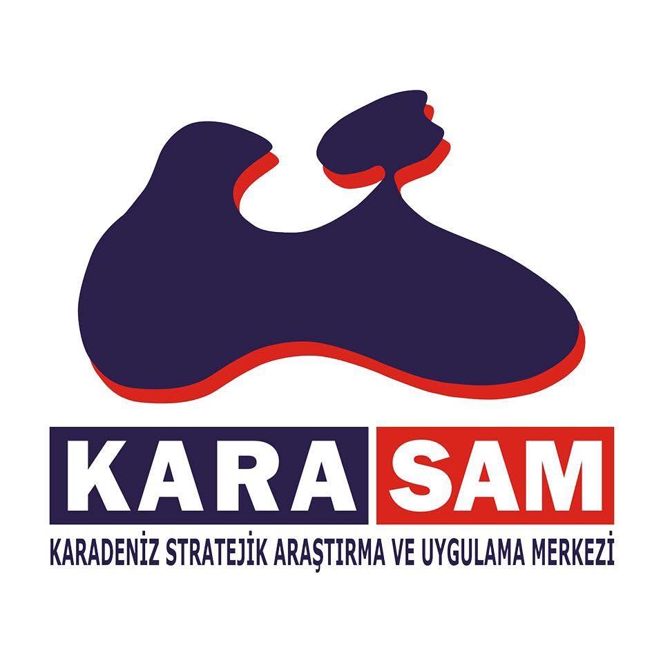
KARASAM Full-Color Corporate Logo

Original Full-Color Corporate Logo

The primary logo required for use in official digital publications, web interfaces, posters, presentations, and full-color printed materials.
Secondary / Monochrome Usage
KARASAM Grayscale Corporate Logo

Grayscale (Monochrome) Logo

The adapted version for black-and-white official correspondence, fax printouts, single-color academic book/journal prints, and newspaper advertisements.

2. Logo Description and Symbolic Meaning

Geographical Form: Black Sea and Crimea Silhouette

The main figure at the top of the logo depicts the geographical map silhouette of the Black Sea and the Crimean Peninsula in the north (along with the Sea of Azov indentation) in an abstract and holistic form. This form directly symbolizes the Center's regional expertise focusing on the Black Sea Basin, the Caucasus, and the Eurasian geography.

3D Layering: Strategic Depth

The red shadow and layer effect along the lower borders of the map silhouette represents the geopolitical dynamism of the region and strategic depth. It emphasizes the vision of producing multidimensional scientific and strategic analyses that go beyond surface-level events.

Typographic Structure and Corporate Balance

Positioned beneath the map form within two separate rectangular blocks, the expressions "KARA" (navy background) and "SAM" (red background) combine the concepts of Black Sea (Karadeniz) and Strategic Research Center (Stratejik Araştırma Merkezi) with a strong visual balance. The full title at the bottom completes the corporate identity.

Strategic Dark Navy HEX: #24194C | RGB: (36, 25, 76)
Dynamic Flag Red HEX: #D81E12 | RGB: (216, 30, 18)
Academic Monochrome Gray HEX: #334155 | Print Black (85% K)

3. Logo Usage Guidelines

✅ Proper Usage Principles

  • Preserving Proportions: When scaling the logo up or down, the aspect ratio must always be kept locked.
  • Clear Space (Protection Zone): A clear space of at least half the height of the "KARA" and "SAM" blocks must be maintained around the logo; no other text or graphic elements should intrude into this area.
  • Background Contrast: To maintain legibility, white or very light-colored backgrounds should primarily be preferred.
  • Minimum Size: To prevent the bottom title ("KARADENİZ STRATEJİK ARAŞTIRMA VE UYGULAMA MERKEZİ") from losing legibility, the logo should not be used at a horizontal width smaller than 30 mm in printed materials or 140 px on digital screens.

❌ Incorrect Uses to Avoid

  • No Distortion: The logo must not be stretched horizontally or vertically, skewed, or subjected to perspective effects.
  • No Color Alteration: It must not be recolored with arbitrary colors outside the corporate navy and red tones (or non-standard filters).
  • Preserving Structural Integrity: The map figure, the "KARA | SAM" blocks, and the subtitle must not be detached from one another or rearranged in different proportions.
  • Complex Backgrounds: It must not be placed directly over multicolored, patterned, or dark photographs (without a white protective backing) that reduce the contrast of the logo.

4. Compliance with the Giresun University Visual Identity Guide

The KARASAM unit logo is structured to represent the academic and strategic identity of the unit in accordance with the standards of the Giresun University Visual Identity Guide. In official correspondence, symposium/panel posters, book publications, and the corporate website jointly representing the University and the Center, the official Giresun University logo is positioned in the primary location (top-left or top-center) as the parent institution identity, while the KARASAM logo is used as a complementary unit logo at an equivalent alignment (top-right or within the designated unit area) in accordance with the hierarchical proportions specified in the guide.