 Black Sea Center for Strategic Research and Application
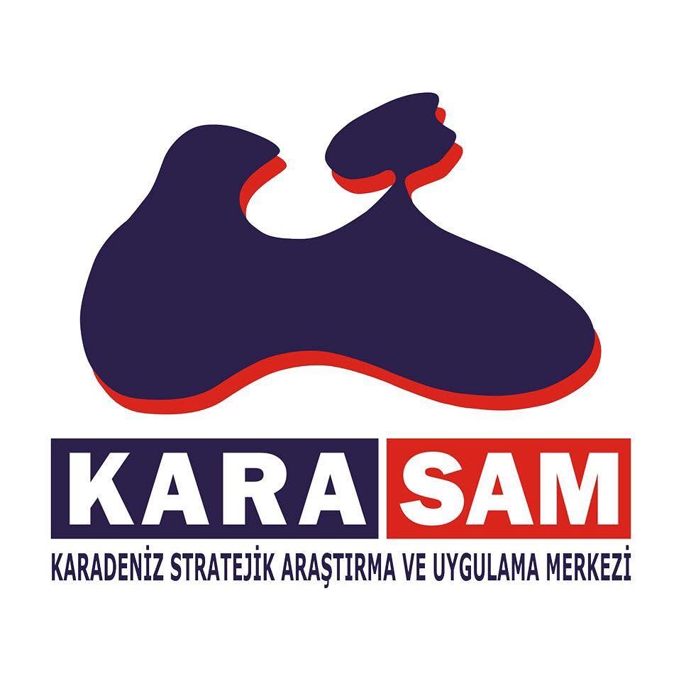
The primary logo required for use in official digital publications, web interfaces, posters, presentations, and full-color printed materials.
The adapted version for black-and-white official correspondence, fax printouts, single-color academic book/journal prints, and newspaper advertisements.
The main figure at the top of the logo depicts the geographical map silhouette of the Black Sea and the Crimean Peninsula in the north (along with the Sea of Azov indentation) in an abstract and holistic form. This form directly symbolizes the Center's regional expertise focusing on the Black Sea Basin, the Caucasus, and the Eurasian geography.
The red shadow and layer effect along the lower borders of the map silhouette represents the geopolitical dynamism of the region and strategic depth. It emphasizes the vision of producing multidimensional scientific and strategic analyses that go beyond surface-level events.
Positioned beneath the map form within two separate rectangular blocks, the expressions "KARA" (navy background) and "SAM" (red background) combine the concepts of Black Sea (Karadeniz) and Strategic Research Center (Stratejik Araştırma Merkezi) with a strong visual balance. The full title at the bottom completes the corporate identity.